 Much has been written & researched about the psychology of colour and its application to retail environments. The general rule of thumb being to choose colours which support both the shopper experience & the psychological headspace you want to draw out in the consumer, then use them judiciously – by which I mean don’t splash them everywhere but use them strategically.
When you’re in an airport environment, you’re dealing with a higher proportion of people who probably weren’t planning to purchase your product. There may be, and often is, a prior consideration of the category or even the item but there wasn’t really any plan to purchase it at the airport. These purchases are often mistakenly called “impulse” purchases but in reality most aren’t. People generally don’t purchase an Armani handbag on a pure whim – they probably have some experience with the brand already, very likely know the latest range of Armani handbags, perhaps have browsed for them elsewhere even if only in magazines, they’re interested in owning one and perhaps have it on their wishlist of things to get “sometime”. What is impulsive is their decision to purchase there and then at the airport – not to purchase it at all. Therefore colour choices are about reflecting the brand experience (to tap into that pre-consideration) then stimulating action.
In other cases, say with confectionery, chocolate, toys, gadgets etc the purchase is genuinely impulsive with little if any prior consideration even when its a gift. This creates a different set of challenges for these types of products in airports because they need to stimulate the desire as well as the sale.
 The popular wisdom in airport fitouts and indeed many shopping centre fitouts is to choose starkly neutral pallettes in the fitouts to allow the natural colour of product to stand out. That’s logical and sensible in some product categories, particularly those with either a level of pre-planning or where the brand name alone functions as the prompt back into the consideration mindset. It doesn’t necessarily work though on products which are purely impulse, where the desire for the category has to be stimulated before you can even begin to convert this into a sale.
Colour can be used to do this though on its own its rarely sufficient and needs to be paired with other instore activities to stimulate the other senses – smell, touch, sound etc. But just looking at the colour side of the equation, what colours could be used in these situations?
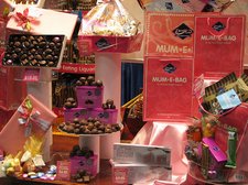
In the case of an impulse driven confectionery or chocolate store you’d want to stimulate the sweet tooth first. Perhaps you might also want to create a sense of indulgence or a desire for self-gratification. Oranges & reds can stimulate the appetite but pink can make us crave sugar – so that’s a great place to start with a lolly shop.
Next we know that brighter pinks tend to communicate youthful, fun & exciting. Very vibrant pinks (like hot pink or magenta) have they 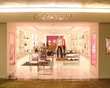 same high energy as red in terms action but are less aggressive. Some studies have also suggessted that pink with women can stimulate a reflection back to the more carefree days of childhood – which also isn’t an altogether bad idea in an economic crisis when you really don’t want people to consider whether money spent on confectionery is really “sensible”.
So pink seems like a good choice if you’re running a lolly or chocolate shop at an airport & need to stimulate the craving for something sweet as well as minimise any concern with spending money on something altogether unnecessary – not that I would ever suggest chocolate was EVERY unnecessary.
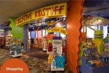
Now lets consider another impulse categories at airports – toys & gizmos. What I’m meaning here are those little gadgets you buy that you really don’t need at all but hey they’re fun to play with for a while. They’re normally cheap and serve no real purpose in life other than fun.
Airports by & large are anything but fun environments but fun is usually a component at least of people’s desires when they’re travelling. So it should be sitting there on the occassion ready to be drawn out – indeed they should want it to be drawn out. And lets face it, unless you can stimulate that sense of fun & playfullness you’re never going to get people to buy those impulse driven toys & gizmos.
 So, trolling through the research on colours & what they stimulate in people’s mindsets, what stimulates fun?
Yellow is known as a colour of happiness & cheerfulness and it does raise body rates like red, bt its effects are less stable. Its a good colour if you want to build optimism but not so much about pure childish fun.
Orange is one of those colours which is controversial, probably more than most other colours. People love it or hate it which many hypothesise is because of people’s attitude to how it makes them feel. Orange is considered to be fun & flamboyant. Its extroverted, pleasure seeking and a strong emotional stimulant. Some people  react to that, particularly if they’re fairly repressed or conservative – but would they be your target market anyway. Its also sometimes communicates cheapness which can be a negative but not if its a part of your selling proposition. Whenever you’re choosing colour schemes for stores its less about what a colour does in general than how the market you’re targetting responds to it.
So orange seems like a good colour to use with this type of store to stimulate the sense of pure childish fun amongst those who are seeking that – whether it be because they have kids travelling with them, they have kids at home and want to share with them some of the fun they’re going to have on their holiday etc.
None of that suggests that stores should be all that colour – that can result in overstimulation and also you have to consider you have other messages too that you want to weave into your colour message.
The question then becomes what colours to pair these with. Colour psychology research suggests that children respond better to strongly contrasting or complimentary colours whereas adults tend to respond better to harmonious colour combinations – such as triads or even more popular are two-thirds of a triad (ie choosing two colours out of a triad).
 In airports this makes it particularly tricky because you need to think very carefully through who is likely to drive going into the store – or purchasing from the store. Will it be because the child wants to go there and the parent gives in because they want to make the child happy – or will it be led by an adult? And which do you want to encourage? Partly that decision depends on the passenger mix on the airport but also very importantly where the store is located within the terminal, what frame of mind passengers are likely to be in by the time they get to that part of the terminal etc.
Its not simple but there is some science you can put behind these decisions, which can then be combined with the art of the designer to create wonderful shopping experiences which also sell. Colour does have a role to play in airports, fitouts don’t all have to be neutral.
![Reblog this post [with Zemanta]](http://img.zemanta.com/reblog_e.png?x-id=077cdc28-ba5d-4fbc-9ff6-c1d4f0cf1379)