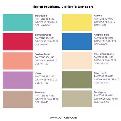
 Pantone are pretty good at picking colour trends or perhaps its just that people follow what they say and therefore create products in those colours. Either way we’re likely to see lots of turquoise in 2010, both in products and retail outlets.
“Turquoise evokes thoughts of soothing, tropical waters and a languorous, effective escape from the everyday troubles of the world, while at the same time restoring our sense of wellbeing,” noted Pantone in a statement announcing the selection.
“Turquoise is universally appealing. It puts everyone in the same state of mind — on vacation,” says Jane Schoenborn, design director at Lilly Pulitzer. “Turquoise for us is a really big color. A lot of times it’s transporting, whether you’re actually going to a resort destination or not.”
Leatrice Eiseman, executive director of the Pantone Color Institute, says there was no runner-up to turquoise in her mind because people crave escapism and freshness after a tough year. The shade is on the cusp of blue and green, which makes it both inviting and serene — characteristics associated with blues — and invigorating and luminous, which comes from green, she says.
Other colours in Pantone’s Spring 2010 pallette are shown below and they change each season with the Turquoise continuing throughout the whole year.

![Reblog this post [with Zemanta]](http://img.zemanta.com/reblog_e.png?x-id=71266769-50a0-41c3-99ad-cf1cbd03d746)


