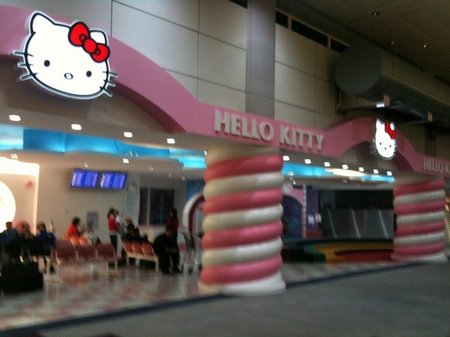
Airports are always looking for new ways to make money, improve wayfinding and make the airport experience more enjoyable. This example from Taipei creates some interesting ideas. I don’t know whether the airport is generating revenue from Hello Kitty branding these departure gates or whether they’d doing it purely as something fun. But consider for a moment the possibilities….
The Hello Kitty branding of these departure gates is not simple signage. They’ve taken the brand onto the columns, the colour of the floor tiles, the seats, walls etc. They have really totally “branded” these gates as a Hello Kitty experience.
That’s obviously not only great for the brand but its also not bad for passenger wayfinding either. OK, I have to admit I wouldn’t be that thrilled with leaving from a “Hello Kitty” gate but I could certainly find it easier. I could also see it very easily and perhaps having seen it, be prepared to spend a little more time in the shopping area as I know more accurately where I have to go to depart.
For the brand its not only very high visibility but it also gives the brand the opportunity to help passengers rather than just building awareness. People are both excited & nervous, happy & sad, enlivened & tired when sitting in a departure gate. This is a perfect opportunity for a brand to genuinely do something of value to them – which we all know these days work far better than simply telling consumers how wonderful a brand is….. prove it.


