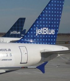
 JetBlue’s strategy is not news to most people – a low cost airline distinguishing itself by actually giving a damn about its customers, listening to them & talking to them. Saving money where they can but not compromising on the things which are really important to their passengers – which they know because yes, they listen to them.
They appeal particularly to the people who probably could spend more on an airline ticket but who don’t want to – why should they waste their hard earned money if they don’t need to?
So what’s all that got to do with an airport development? In most countries it wouldn’t have much of an impact at all because the terminals aren’t controlled by the airlines but by airport operators. However in the case of JFK and T5 it has a lot to do with it and this ethos flows through the terminal itself.
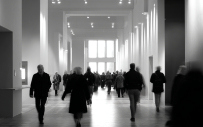
JFK T5 is all about passenger experience. They looked at what people go through in airports, what state of mind it gets them into and put together an airport which turned those negatives into a positive experience.
This is the first in a series of posts dealing with JetBlue’s new terminal at JFK – T5. Why its different and how it works.
You need to remember with JFK Terminal 5 that it is the first airport terminal to be built since 9/11 so rather than needing to “deal” with the issues of security it has been possible to integrate the security processes with the overall passenger experience. That’s a big part of what has enabled T5 to be approached differently.
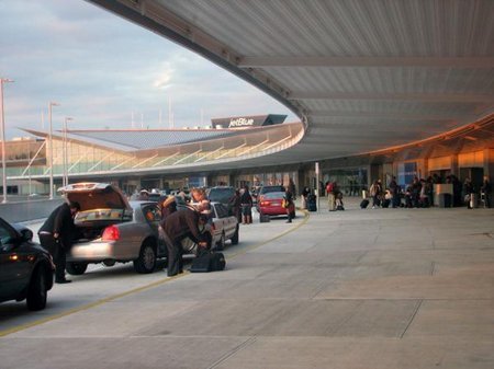
In terms of the terminal itself, the T5 difference is visible from the moment you arrive at the curb. There’s a 30ft curbside for easy drop-off of passengers & luggage. If your are travelling domestically you can check in online and drop your bags off curbside (for $2 per bag) or go inside and use the quick bag drop areas (no charge). If you are travelling internationally of course you need to go to the full-service counters but these have been structured to perform with a 15 minute processing time so its pretty quick by international comparisons.
This may seem like an unusual priority but with JetBlue, 65% of passengers are dropped off curbside, only 35% arrive via Skytrain. Those that do arrive via Skytrain tend to enter via the north side and hence the terminal shape itself is asymetical.
 The external architecture of T5 frankly isn’t much to write home about. Some have waxed lyrically about it, personally it looks sterile and well, pretty darned boring. But then again I don’t personally get turned on by how pretty an airport terminal is, I’m more concerned by how it functions & the experience passengers have – and its there that this terminal does excel. That philosophy is also totally inkeeping with JetBlue’s positioning of spending money where people care and cutting costs on things which don’t matter.
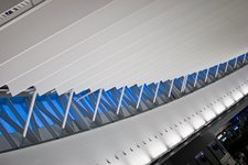 There is a noticable strategic use of natural light, partly for customer experience, partly to reduce the operational cost of lighting. There are clearstories in the ticket hall & marketplace and an open light shaft connecting the departures level with the baggage hall below.
Anyway, once you’ve either checked your bags in curbside or entered the Ticketing Hall, you’re struck by another fairly average looking area which is functional more than attractive. Its clean, bright, airy and definately big but they’ve used lower ceilings in an attempt to reduce costs plus to speed people along out of the area. You need to keep in mind here 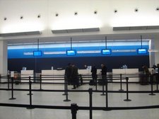 that JetBlue is predominately domestic and the majority of people either check in online or electronically at the kiosks. So time spent in this area is fairly minimal and queues by their nature are short. The check-in counters are groups, reminiscent of some international terminals more than domestic ones. This allows for quicker check-in as groups of flights are allocated to particular banks of checkin counters. The queue process is the same old snake queue but each one only covers 4 desks, making one side of the queue clearly visible from the other and creating that sense that things are moving.
The TSA screening area runs at 4000 bags per hour and the security checking area has 20 stations. Frequent travelers can select lines that bypass those with children or otherwise need to move more slowly. There are also dedicated family lines which people can self-select. These are wider to accommodate strollers and the like. Rubber flooring has been used which feels more comfortable under shoeless feet. A 225ft long bench beyond the X-ray scanners allows passengers to “re-vest” and get themselves organised after security – quickly and with ease.
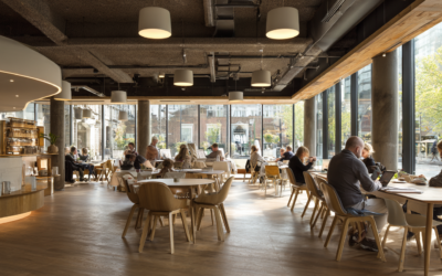
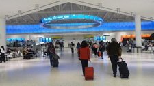 The security area opens to a 55,000-square-foot “marketplace” with a noticably higher ceiling height and more lighting. The effect walking into the space is both a sense of arrival and that the excitement is just beginning. There is a large circle bank of screens suspended on wires which reflect the roof architecture. These monitors are designed to show local art as well as carry periodic advertising & wayfinding messages.
You also see the strategic use of colour as natural wayfinding at this point with blue dominant on the left and orange to the right.
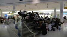 The use of horizontal lines is designed to slow people down and start to create a time dialation. You notice also through this area the impact of the choreography of Rockwell & Mitchell, where obstacles are placed to direct movement in a subtle, organic manner. Most particularly the bleacher like seating which subtly lead outbound travelers toward the periphery of the space and into the longer, more circular route through the retail area. Meanwhile inbound travellers are directed straight between then, down a level and swiftly out. The periphery walls are also curved to slow down the outbound experience and increase the likelihood of lingering over the retail.
The stadium seating is designed for functionality & comfort as well as passenger experience. They contain charging points, have cushions and elevate the passenger above the activity so they can watch the theatre of the airport.
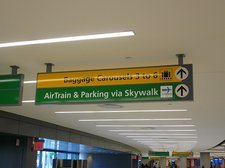 The directional signage uses yellow & green and these two colours are noticably absent from the outside of most shop designs. Directional signage has also been placed such that the next sign is always visible from the sign you’re now at – reinforcing the sense of ease of movement and minimising any anxiety moving through the terminal.
The basic structure and layout of the central marketplace is designed to prompt passengers around the retail which is essentially positioned around the outside of the central marketplace as well as down the piers.
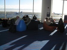 Rather than taking a traditional airport retail approach of trying to discourage passengers moving down to the departure gates (and hence away from the spending area), at T5 F&B has been taken to the departure lounges and integrated into that experience in an innovative way where passengers don’t need to leave their seats – they can order via onscreen terminals and the food is delivered to them. As there is no commercial pressure to keep passengers away from the departure gates, they have been made larger, have more seating and even lounging seats. Powerpoints are aplenty in the departure lounges and wifi is free throughout the terminal – avoiding any propensity for passengers to head toward wifi points or necessarily to lounges and out of the central food area. Its totally a matter of choice where you want to go and wherever you go there are F&B options and opportunities for the airport to generate revenue.
More on the retail offering and other features of JFK T5 in the next post……