Lets face it, sandwich packaging is pretty boring. I don’t know how many sandwiches I’ve bought in my life but I don’t think I’ve ever really seen one that made me go wow.

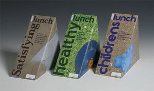
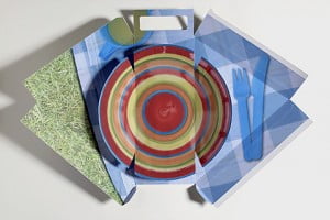
 Some are creative but not terribly practical or they don’t deal to a particular aspect of the whole pre-packaged sandwich purchasing process. Like these ones to the left, they look good but you can’t really clearly see the sandwich itself – which for me at least is one of the key criteria in choosing a sandwich. I like to see as much of the sandwich as possible, not just a little window. On the plus-side though they do open out into a little tray to eat your sandwich on.
I know you can tell what’s in it from just seeing one side but for some reason I downgrade my assumptions on the quality of the sandwich the less I can see. But those packages which allow you to see thee whole sandwich and have little room for information on them or branding, similarly miss the boat and end up looking bland.
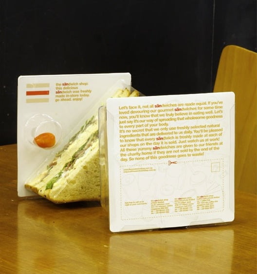
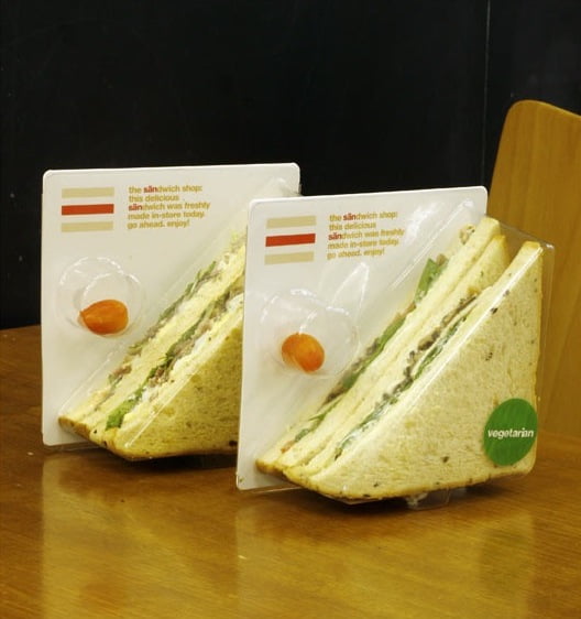
 That’s why I was somewhat pathetically excited when I came across the packaging from The Sandwich Shop in Singapore. Its not by any means new – they’ve been around for quite a few years – but I do like it.
They have created custom moulded plastic packaging which allows the customer to get a clear all-round view of the sandwich. It has a slide-and remove backing card which carries information about the store but can also be used for information about the particular sandwich variety if you wanted to. The packaging also contains a “freebie” (normally a cherry tomato or lime) and a stand which doubles as a “finger slot” so you can lift your sandwich out easily.


![Reblog this post [with Zemanta]](http://img.zemanta.com/reblog_e.png?x-id=8d66a874-7494-4569-9259-14df9c18d482)


